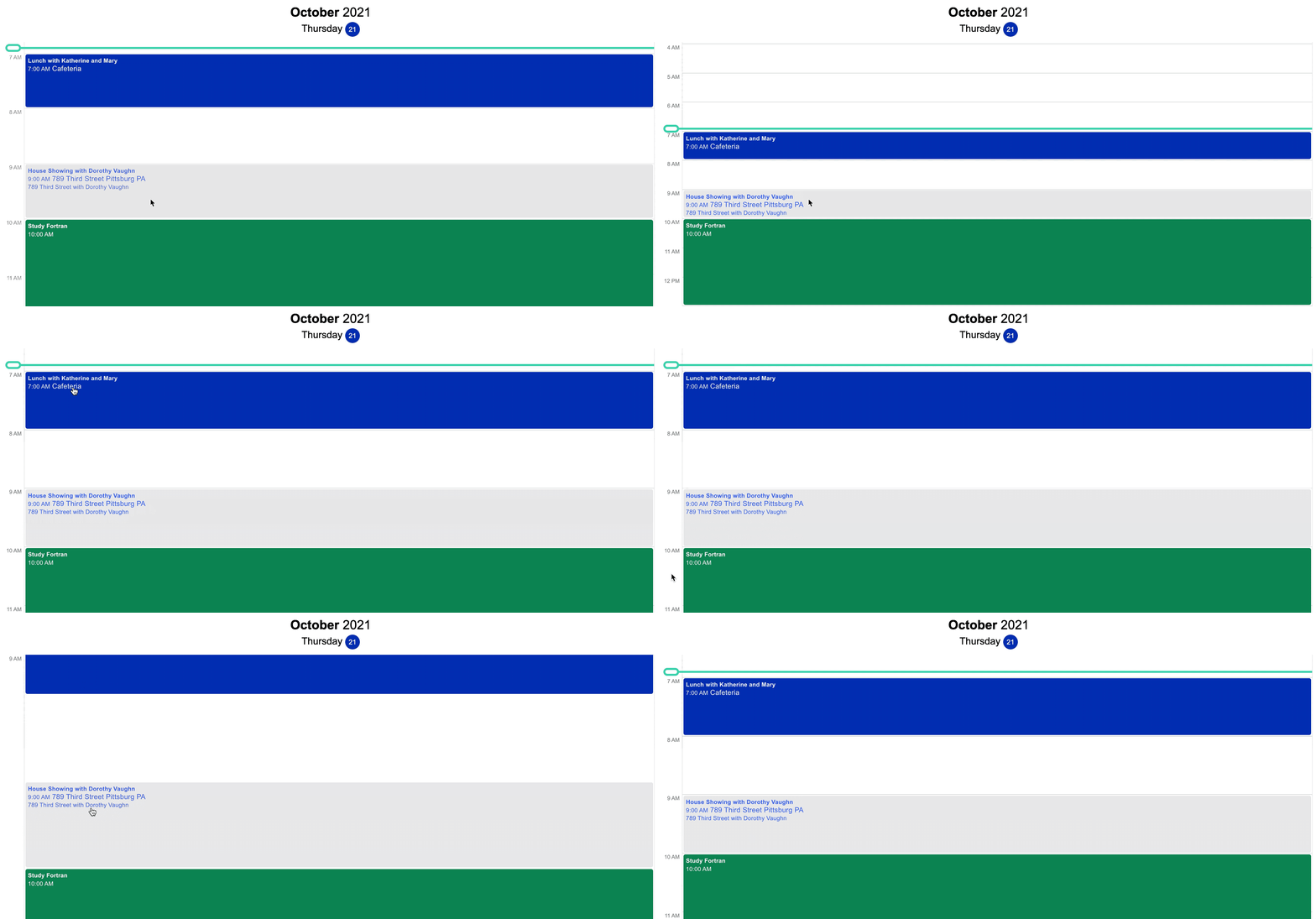
Use the Nylas Agenda Component to display calendar data. Without needing to write a single line of code, the Agenda Component comes with:
- Theme options
- Ability to change display date
- Events listed with time, event title, location, and description
- Event details are expanded on click
- Display multiple calendars
Quickstart
Section titled “Quickstart”- Create a Agenda component in your Nylas Dashboard.
- Add it to your application.
<head> <!-- Import the script from CDN --> <script src="https://unpkg.com/@nylas/components-agenda"></script></head><body> <!-- Place the component on the page --> <nylas-agenda id="<PASTE_YOUR_COMPONENT_ID>"></nylas-agenda></body>That’s It! Agenda is ready to use!
Prerequisites
Section titled “Prerequisites”Before you use components, you must have the following prerequisites:
- A v2 Nylas application.
- The minimum required scopes:
- Agenda:
calendar - Composer:
email.modify,email.send,contacts.read_only - Contact list:
contacts.read_only - Email:
email.modify,contacts.read_only - Messages:
email.read_only,contacts.read_only
- Agenda:
- An application to add the component to.
Agenda Installation Options
Section titled “Agenda Installation Options”You can install Agenda in 2 ways:
npm Package
Section titled “npm Package”- Run
npm i @nylas/components-agendaoryarn add @nylas/components-agenda. - Then import and render the component.
// Import the web componentimport "@nylas/components-agenda";
// In render method<nylas-agenda></nylas-agenda>;
Script Tag
Section titled “Script Tag”Use the CDN script tag, https://unpkg.com/@nylas/components-agenda.
<head> <!-- Import the script from CDN --> <script src="https://unpkg.com/@nylas/components-agenda"></script></head><body> <!-- Place the component on the page --> <nylas-agenda></nylas-agenda></body>Ways to Use Agenda
Section titled “Ways to Use Agenda”- Use Agenda with Nylas Data - Choose this option if you want to integrate your existing Nylas accounts with the Agenda Component.
- Use Agenda with External Data - Choose this option if you want to pass in your data.
Use Agenda Component with Nylas Data
Section titled “Use Agenda Component with Nylas Data”You’ll learn how to use your Nylas accounts with the Agenda Component.
Create the Agenda Component
Section titled “Create the Agenda Component”- Log in to your Nylas dashboard.
- Click Components > Agenda
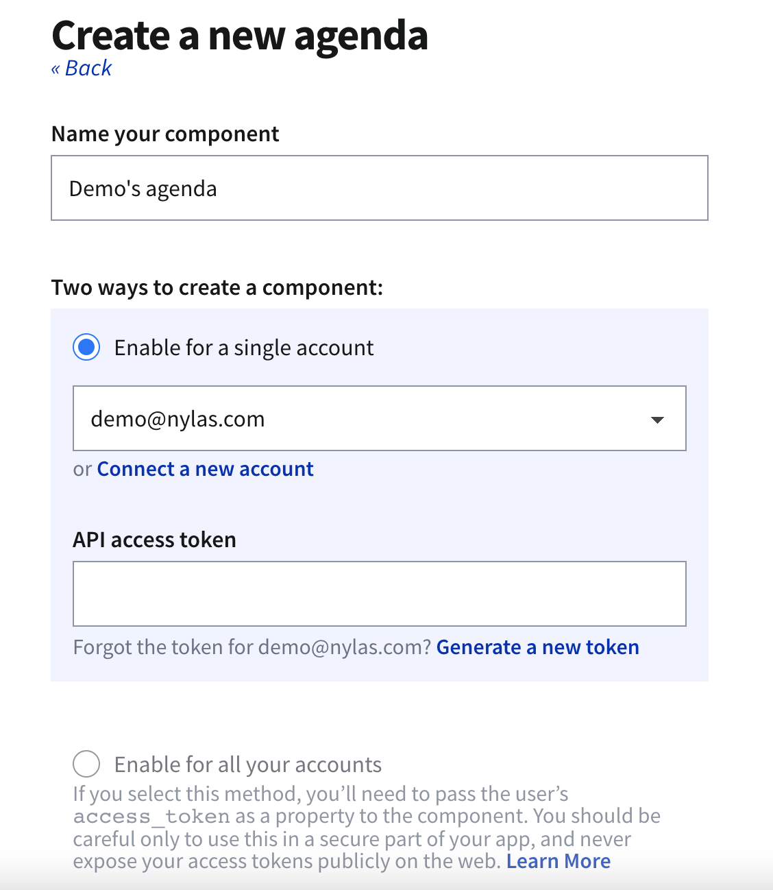
- Name your Component and select the account. To quickly start testing your Component select Enable for a single account.
- To learn how to enable components for multiple accounts see Authorizing Components
- Use an existing access token or generate a new one.
- Enter the domain the component will run on. Without the domains, the component will not run
- To run on localhost, enter an asterisk.
*. Remember to change this before going to production.
- To run on localhost, enter an asterisk.
- Save your new component.
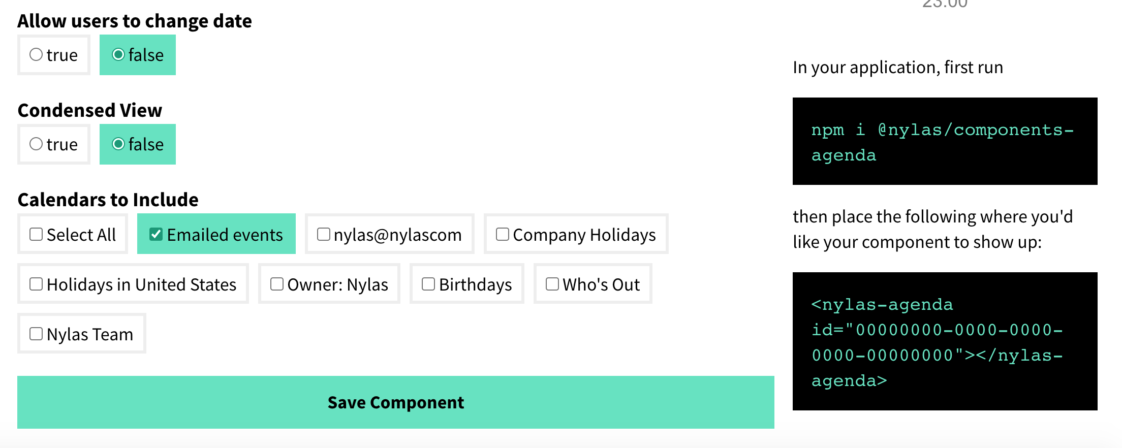
- On the Edit page, you can configure your component behavior and appearance.
Generate an Access Token
Generating a new access token will not replace your existing access token; it will create a second access token with the same scopes as the previous token. You can revoke access tokens at any time.
Add the Component To Your Application
Section titled “Add the Component To Your Application”- On the Edit page, there are instructions for installing the new component.
- If you haven’t installed the Agenda Component already, open a terminal and run
npm i @nylas/components-agenda. - Then add your Nylas component. Copy and paste your component code into your application.
<nylas-agenda id="your-component-id" calendar_id="your-calendar-id"></nylas-agenda> - You should refresh your application if needed. Any configuration options set on the editing page will apply to your Component.
Agenda Height
Section titled “Agenda Height”When adding an Agenda component, it takes on the height of the parent container. If your agenda isn’t showing, try adding it to a div with the height specified.
<div class="app" style="height:800px"> <nylas-agenda id="3a3605a4-6d8c-49d4-8e79-0e417ac7483b"> </nylas-agenda></div>Use Agenda Component with External Data
Section titled “Use Agenda Component with External Data”The Nylas Agenda Component can accept an array of objects for events. You can pass in any event data from our events endpoint. In this example, we are passing the data needed to create an event. The data input should match the formatting of the Nylas Events Object.
-
Install the Nylas Agenda Component.
npm i @nylas/components-agenda.import Agenda from "@nylas/components-agenda";const staticEvents = [{title: "Some event that I am manipulating outside of the context of Nylas",description: "Passed in from HTML!",participants: [],when: { end_time: 1600444800, object: "timespan", start_time: 1600438500 }},{title: "Some I got from elsewhere",description: "Passed in from HTML!",participants: [],when: { end_time: 1600449999, object: "timespan", start_time: 1600448500 }},{title: "A third event of the day",description: "Passed in from HTML!",participants: [],when: { end_time: 1600468500, object: "timespan", start_time: 1600458500 }}];</script><main><h1>Nylas Agenda</h1><nylas-agenda events={staticEvents}/></main> -
Add the event data to your
nylas-agenda.<nylas-agenda events={staticEvents}/>.
Authorizing Components
Section titled “Authorizing Components”You can authorize components to work with a single account or multiple accounts.
Enable for a single account
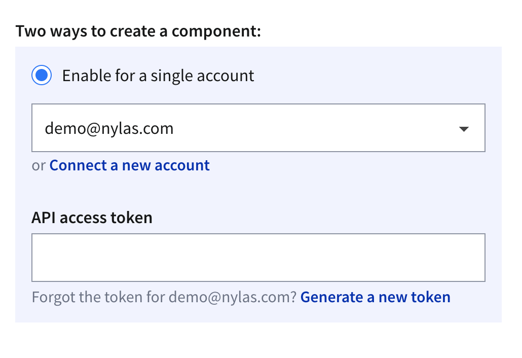
Section titled “Enable for a single account”Enabling components for a single account is a good way to get started quickly. If you use this method in your production application, you must authenticate each account from the Nylas Dashboard one-by-one.
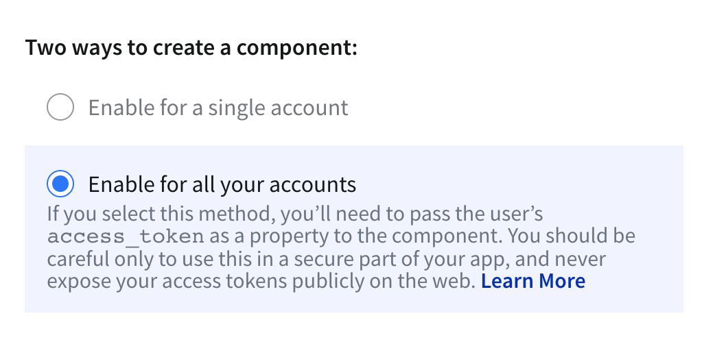
Enable for all accounts
Section titled “Enable for all accounts”Dashboard previews don’t work when you enable components for all accounts.
To enable components for all accounts, you must pass in a user’s access token as a property of the component. One way to do this is to create a login screen, capture the access token, and pass it to the component. You can pass access_tokens directly in the component, as in the following example.
<nylas-agenda id="COMPONENT-ID" access_token="USER-ACCESS-TOKEN" />Be sure to keep your users’ access tokens hidden, and never expose them online.
Customization
Section titled “Customization”Nylas components are flexible and can be customized for your needs. You can customize the display in 2 ways:
- From your Nylas dashboard - Use this option if you are using the Component created from the dashboard.
- Directly in the application - No matter where you created your Component, you can use this method to edit the display options.
The options are the same for both the application and dashboard. The names are slightly different, and the application requires a few more options.
Agenda Event Listeners
Section titled “Agenda Event Listeners”| Name | Description |
|---|---|
manifestLoaded | This event is dispatched on load when the manifest is loaded. The handler is passed the manifest argument. |
onError | Emitted if an error occurs while fetching data in the component. The handler is passed an object with the component id as the key and the error as the value. |
eventsLoaded | Emitted if no events prop provided. Returns list of calendar events. |
dateChange | Emitted if date changes. |
Nylas Dashboard Display Options
Section titled “Nylas Dashboard Display Options”Customize the display by going to your application > Components. Then select the Component you want to edit. When you are making changes in the dashboard, the display of the Component will update.
| Name | Description |
|---|---|
| Allowed Domains | Use glob patterns to match allowed domains |
| Theme | Set the theme of your Agenda Component. |
| Hide Event Details | Show all events as Busy. |
| Show Date in Header | Add date to the Agenda Header. |
| Start or end day when event start or end | Display the Agenda start and end time by 24 hour clock or display Agenda start and end time using earliest and last event. |
| Color items by | Color by calendar or events. |
| Disable pinch to zoom | Adds an effect to expand or contract the calendar display. |
| Hide current time bar | Display a line on the Agenda that illustrates the current time. |
| Allow users to change date | Enable left and right arrows to allow users to change calendar display date. |
| Condensed View | Display the agenda events in a single column. |
| Calendars to Include | Select any available calendars to display. If no calendar is selected, the component must be provided at least one calendar ID using the calendar_ids property to display Nylas data. |
Application Component Display Options
Section titled “Application Component Display Options”To enable most features, add them to your configuration. For example, allow_date_change by default is false. Adding it to your configuration will automatically make it true—no need to set it to true.
import React from "react";import "./styles.css";import "@nylas/components-agenda";
export default function App() { return ( <div className="App"> <nylas-agenda id="your-agenda-id" access_token="your-access-token" // only if this component has been enabled for all accounts calendar_ids="your-calendar-ids" //only if using Nylas account data allow_date_change allowed_dates auto_time_box click_action color_by="event" condensed_view eagerly_fetch_events header_type hide_current_time hide_ticks prevent_zoom show_as_busy show_no_events_message theme="theme-1" ></nylas-agenda> </div> );}| Name | Type | Description |
|---|---|---|
| allow_date_change | boolean | Allow your users to change the date using arrows. Allow date change will let them go through all calendar events instead of just one day. header_type must not be none. Default: false |
| allowed_dates | Date[] | string | Limits the dates that can be displayed by the Agenda to those provided by this property. Default: [] |
| auto_time_box | boolean | Display the Agenda start and end time by 24 hour clock or display Agenda start and end time using earliest and last event. Default: false |
| calendar_ids | string | A comma-separated list of IDs of the calendars to display. You can get a list of calendar IDs by making a request to GET /calendars. At least one calendar ID must be provided if using Nylas data. |
| color_by | enum | Color the calendar by events or by calendar. If you have multiple calendars in one agent view, select calendar to show each calendar as it’s own color. Available options: calendar, event Default: event |
| condensed_view | boolean | Display the agenda events in a single column. Default: false |
| eagerly_fetch_events | boolean | Pre-fetches nearby dates for smoother transitions. Default true |
| header_type | string | Changes the amount of information in displayed in the header. Available options: full, day, none Default full |
| hide_current_time | boolean | Display a line on the Agenda that illustrates the current time. Default:false |
| display_metadata | boolean | Display Event Metadata within event body. Default true |
| prevent_zoom | boolean | Adds an effect to expand or contract the calendar display. Default: false |
| hide_ticks | boolean | Hide hours from the left margin. Default false |
| show_as_busy | boolean | Show all events as busy instead of event details. show_as_busy only has an effect when set in the Nylas Dashboard Default: false. |
| show_no_events_message | boolean | Display a message if there are no events for the selected date. Default: false |
| theme | enum | Set the theme of your Agenda Component. Available options: theme-1, theme-2, theme-3, theme-4, theme-5. Default: theme-1 |
Custom CSS
Section titled “Custom CSS”To customize the CSS, you can change the theme custom property to one of the provided themes by Nylas:
<nylas-agenda id="your-agenda-id" theme="theme-5"></nylas-agenda>You can also easily override styles for pre-selected themes by writing your own CSS vars. The customizable CSS variables are the following and the value assigned should be a valid CSS property value:
nylas-agenda {  --nylas-agenda-calendar-1-bg-color: inherit;  --nylas-agenda-calendar-2-bg-color: inherit;  --nylas-agenda-calendar-3-bg-color: inherit;  --nylas-agenda-calendar-4-bg-color: inherit;  --nylas-agenda-calendar-5-bg-color: inherit;  --nylas-agenda-calendar-6-bg-color: inherit;  --nylas-agenda-calendar-7-bg-color: inherit;  --nylas-agenda-calendar-8-bg-color: inherit;  --nylas-agenda-calendar-9-bg-color: inherit;  --nylas-agenda-calendar-10-bg-color: inherit;
  --nylas-agenda-empty-event-bg-color: inherit;  --nylas-agenda-current-time-bg-color: inherit;  --nylas-agenda-icons-bg-color: inherit;  --nylas-agenda-header-bg: inherit;  --nylas-agenda-header-color: inherit;  --nylas-agenda-declined-event-color: inherit;  --nylas-agenda-ticks-color: inherit;  --nylas-agenda-event-color: inherit;  --nylas-agenda-dividers-border-color: inherit;}
Custom Callbacks
Section titled “Custom Callbacks”You can’t pass callbacks as attributes
You must select the element, for example document.getElementById, and then attach the custom properties.
| Name | Type | Description |
|---|---|---|
click_action(clickEvent, calendarEvent) | function | Triggered when a user clicks on an event. The callback is provided with the original click event as clickEvent and the event data as calendarEvent. If no callback is provided, the default behavior is to expand/collapse an event on click. |
Emitted Events
Section titled “Emitted Events”The emitted event object will include a details property that contains the event payload.
| Name | Type | Description |
|---|---|---|
dateChange | Date | Requires allow_date_change to be true. Triggered when a user changes the date of the Agenda. |
Allowed Domains
Section titled “Allowed Domains”You can restrict the domains that your component works on using glob patterns, as in the following examples:
nylas.commatches onlynylas.com.subdomain.nylas.commatches onlysubdomain.nylas.com.*subdomain.nylas.commatchessubdomain.nylas.comandsub.sub.subdomain.nylas.com.*matches any domain.
Domain restriction applies only to the domain name. You cannot restrict URL paths (for example, developer.nylas.com/docs/) or protocols (for example, HTTPS).
How Properties Are Handled
Section titled “How Properties Are Handled”Nylas Components follow an order of operations to decide if the dashboard or code takes precedence.
- If the property is passed directly to the Component, use that first.
- If the property is not passed directly in the Component use the dashboard settings.
- If there are no properties set in the Component or the dashboard, use the Component defaults.
Extending Functionality
Section titled “Extending Functionality”Here are a few ways to add more functionality to Nylas Agenda.
Multiple Calendars
Section titled “Multiple Calendars”You can display multiple calendars in a single application in a few ways.
To have multiple accounts in the same view, create an agenda component for each account.
In this example, there are 2 accounts with 1 calendar each (calendar_ids) displayed.
<section> <h2>Dorothy</h2> <nylas-agenda calendar_ids="ciw5iqmm8e8ywlhb8xl8fg8iz" id="801d7467-8663-4800-bdf8-f86a366ff3d0" /> </section> <section> <h2>Kate</h2> <nylas-agenda calendar_ids="2stq9ckhdhnzvs4t8x2wlin9p" id="801d7467-8663-4800-bdf8-f86a366ff3d0" />To have 1 account with multiple calendars, add the calender_id of each account calendar you want to display.
<nylas-agenda id="0e4d7f3-bf3b-4f0e-9faf-589ba9831d35" calendar_ids="1234adv5tgh678h, 1234adv5tgh678h" color_by="calendar"></nylas-agenda>Demo Apps
Section titled “Demo Apps”Fork any of our demo apps to get started.
- Agenda using script tag - Quickly start using the Agenda Component by adding a script tag and the component to an HTML page.
- Agenda React app - How to deploy the Agenda in an React app.
- Agenda month view - Using React, how to display the Agenda in a monthly view.
- Agenda using external data - Using Svelte, how to using external data with the open source Agenda Component.
- Agenda using weekly single calendar view - Using Svelte, how to display a single calendar.
- Agenda multiple calendars in a weekly view - Using React, how to display multiple calendars.
What’s Next
Section titled “What’s Next”Take a look at other Components:
- Mailbox Component
- Contact List Component
- Agenda Component
- Conversation Component
- Email Component
- Composer Component
Check us out on GitHub: