You can use the Nylas Scheduling component to embed a complete scheduling interface directly in your project.
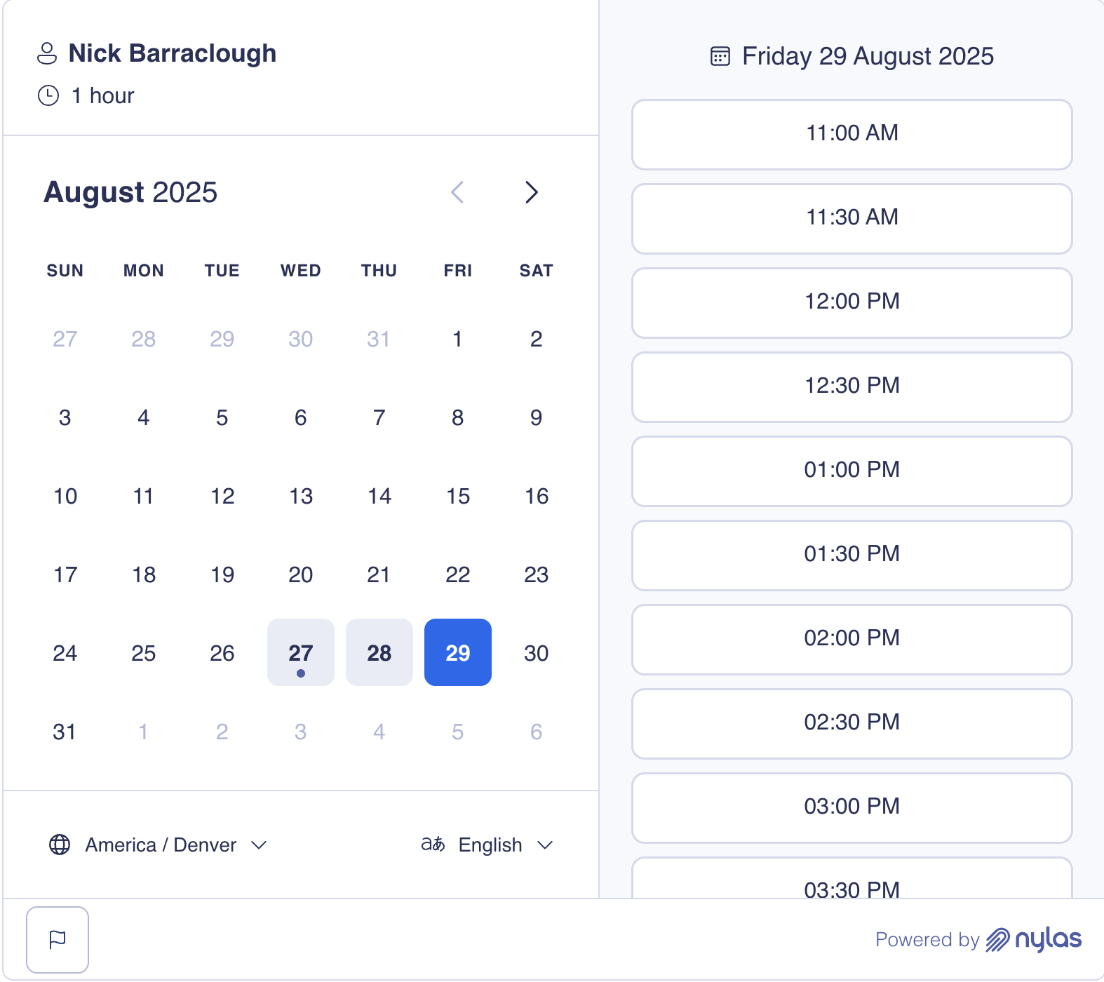
This page covers how to set it up using a Configuration ID or a slug and how to customize it.
How the Scheduling component works
Section titled “How the Scheduling component works”Nylas offers the Scheduling component as a pre-built, extensible web- (HTML/Vanilla JS) and React-based UI component. After you add it to your project, guests can use the Scheduling Page to book meetings.
The Scheduling Component includes…
- Custom event handlers that let you define specific logic or behavior for user actions.
- Composable components that let you customize how each element is arranged and rendered in the UI.
- Custom UI stylings that support CSS shadow parts for a higher level of customization.
The component supports two configuration modes: app and composable. By default, it’s set to app mode. In this mode, the Scheduling component renders all elements it contains, meaning you can embed the pre-built component in your project with minimal configuration. composable mode allows you to customize how the Scheduling component arranges and renders each element in the UI. In this mode, you can embed elements as standalone components.
For more information, see the Scheduler UI components references.
Before you begin
Section titled “Before you begin”Before you can use the Scheduling component, you need to…
-
Install the latest
@nylas/reactpackage.npm install @nylas/reactyarn add @nylas/reactpnpm add @nylas/react
Embed Scheduling component with Configuration ID
Section titled “Embed Scheduling component with Configuration ID”The simplest way to embed the Scheduling component is by passing a Configuration ID.
<!DOCTYPE html><html> <head> <title>Scheduler Integration</title> <script src="https://cdn.jsdelivr.net/npm/@nylas/react@latest/dist/cdn/nylas-scheduling/nylas-scheduling.es.js"></script> </head> <body> <div id="scheduler-container"> <h1>Book a Meeting</h1> <nylas-scheduling configuration-id="<CONFIGURATION_ID>" default-language="en" > </nylas-scheduling> </div> </body></html>import { NylasScheduling } from "@nylas/react";
function BookingPage() { return ( <div className="booking-container"> <h1>Book a Meeting</h1> <NylasScheduling configurationId="<CONFIGURATION_ID>" defaultLanguage="en" /> </div> );}When you use a Configuration ID, the Scheduling component gains direct access to the Configuration, loads faster, and is more secure than passing a slug. We strongly recommend using this approach.
Embed Scheduling component with slug
Section titled “Embed Scheduling component with slug”Use a slug in the Scheduling component when you want to reference a public Configuration by its URL identifier.
<!DOCTYPE html><html> <head> <title>Scheduler Integration</title> <script src="https://cdn.jsdelivr.net/npm/@nylas/react@latest/dist/cdn/nylas-scheduling/nylas-scheduling.es.js"></script> </head> <body> <div id="scheduler-container"> <h1>Book a Meeting</h1> <nylas-scheduling client-id="<NYLAS_CLIENT_ID>" slug="<SLUG>" default-language="en" > </nylas-scheduling> </div> </body></html>import { NylasScheduling } from "@nylas/react";
function BookingPage() { return ( <div className="booking-container"> <h1>Book a Meeting</h1> <NylasScheduling clientId="<NYLAS_CLIENT_ID>" slug="<SLUG>" defaultLanguage="en" /> </div> );}When you use a slug, Scheduler presents a human-readable URL that’s easy to share. This solution also works with Nylas-hosted Scheduling Pages.
Best practices for Scheduling component
Section titled “Best practices for Scheduling component”The following sections cover some best practices to keep in mind when adding the Scheduling component to your project.
Set up error boundaries
Section titled “Set up error boundaries”We recommend wrapping the Scheduling component in an error boundary when you integrate it. The boundary should be able to catch and handle any unexpected errors.
class SchedulerErrorBoundary extends React.Component {  constructor(props) {    super(props);    this.state = { hasError: false };  }
  static getDerivedStateFromError(error) {    return { hasError: true };  }
  render() {    if (this.state.hasError) {      return <div>Something went wrong with the scheduler.</div>;    }
    return this.props.children;  }}
...
Add loading state indicators
Section titled “Add loading state indicators”We recommend adding custom loading indicators to display while the Scheduling component is initializing or completing processes in the background.
function SchedulerWithLoading() {  const [isReady, setIsReady] = useState(false);
  return (    <div>      {!isReady && <div>Loading...</div>}
      <NylasScheduling        configurationId="<CONFIGURATION_ID>"        onLoad={() => setIsReady(true)}      />    </div>  );}
Prepare to clean up events
Section titled “Prepare to clean up events”Your project should be prepared to clean up event listeners when the Scheduling component unmounts.
useEffect(() => {  const handleBooking = (event) => {    // Handle booking    ...  };
  // Add event listener  document.addEventListener('nylas-booking-confirmed', handleBooking);
  // Cleanup  return () => {    document.removeEventListener('nylas-booking-confirmed', handleBooking);  };}, []);
Customize Scheduling component
Section titled “Customize Scheduling component”The Scheduling component includes many customization options — the following sections cover a few. For more options, see the NylasScheduling component references.
Set default language and time zone
Section titled “Set default language and time zone”Set the starting language with the defaultLanguage prop, and the starting time zone with selectedTimezone inside defaultSchedulerState. The component has no defaultTimezone prop. Without these, the Scheduling Page uses the guest’s browser language (since @nylas/web-elements 2.5.2) and browser time zone. Guests can still switch both from the dropdowns on the page. For the full language precedence order, see Localizing Scheduler.
import { NylasScheduling } from "@nylas/react";
function BookingPage() {  return (    <div className="booking-container">      <h1>Book a Meeting</h1>      <NylasScheduling        configurationId="<CONFIGURATION_ID>"        defaultLanguage="es"        defaultSchedulerState={{ selectedTimezone: "America/Mexico_City" }}      />    </div>  );}
Connect to the EU region
Section titled “Connect to the EU region”The Scheduling component calls the US API (https://api.us.nylas.com) by default. If your Nylas application is in the EU data residency region, set schedulerApiUrl to https://api.eu.nylas.com, or the component can’t find your Configuration. In the Scheduler Editor Component, set the region through the domain in nylasSessionsConfig instead.
Upgrade to @nylas/web-elements 2.5.5 or later if you use the React wrapper. Earlier versions could make the first request to the US API on a full page refresh, because they read schedulerApiUrl before React applied its props.
<nylas-scheduling configuration-id="<SCHEDULER_CONFIGURATION_ID>" scheduler-api-url="https://api.eu.nylas.com"></nylas-scheduling><NylasScheduling configurationId="<SCHEDULER_CONFIGURATION_ID>" schedulerApiUrl="https://api.eu.nylas.com"/>Create one-time invitation
Section titled “Create one-time invitation”You can use the Scheduling component to create and display one-time invitations for events. These invitations have a set date and time, and guests can book the event by entering their contact information.
This example configures the default Scheduling Page state (defaultSchedulerState) to open directly on the booking form with a pre-selected 30-minute time slot, so guests skip the date and time picker.
<html>  <body>    <nylas-scheduling />
    <script type="module">      import { defineCustomElement } from "https://cdn.jsdelivr.net/npm/@nylas/web-elements@latest/dist/cdn/nylas-scheduling/nylas-scheduling.es.js";
      defineCustomElement();
      const nylasScheduling = document.querySelector("nylas-scheduling");
      // Set the Scheduler Configuration ID if using public Configuration (`requires_session_auth=false`).      nylasScheduling.configurationId = "<SCHEDULER_CONFIGURATION_ID>";      // OR set the Scheduler session ID if using private Configuration (`requires_session_auth=true`).      // nylasScheduling.sessionId = "<SCHEDULER_SESSION_ID>";
nylasScheduling.defaultSchedulerState = { showBookingForm: true, selectedTimeslot: { start_time: new Date(1739257200 * 1000), end_time: new Date(1739259000 * 1000), }, }; </script> </body></html><NylasScheduling mode="app" // Set the Scheduler Configuration ID if using public Configuration (`requires_session_auth=false`). configurationId={"<SCHEDULER_CONFIGURATION_ID>"} // OR set the Scheduler session ID if using private Configuration (`requires_session_auth=true`). // sessionId={"<SCHEDULER_SESSION_ID>"}
defaultSchedulerState={{ showBookingForm: true, selectedTimeslot: { start_time: new Date(1739257200 * 1000), end_time: new Date(1739259000 * 1000), }, }}/>;Pre-fill the booking form
Section titled “Pre-fill the booking form”You can define bookingInfo to pre-fill the booking form (for example, to pre-fill the guest’s name and email address).
<html> <body> <nylas-scheduling />
<script type="module"> import { defineCustomElement } from "https://cdn.jsdelivr.net/npm/@nylas/web-elements@latest/dist/cdn/nylas-scheduling/nylas-scheduling.es.js";
defineCustomElement();
const nylasScheduling = document.querySelector("nylas-scheduling");
nylasScheduling.bookingInfo = { primaryParticipant: { name: "Leyah Miller", }, guests: [ { name: "Nyla", }, ], additionalFields: { additional_email: { type: "email", }, phone_number: { value: "1234567890", type: "phone_number", }, }, }; </script> </body></html>const bookingInfoData = { primaryParticipant: { name: "Leyah Miller", }, guests: [ { name: "Nyla", }, ], additionalFields: { additional_email: { type: "email", }, phone_number: { value: "1234567890", type: "phone_number", }, },};
<NylasScheduling bookingInfo={bookingInfoData} />;Make pre-filled fields read-only
Section titled “Make pre-filled fields read-only”When you pre-fill the booking form, you can also lock individual fields so guests see the values but can’t edit them. This is useful when the guest is already signed in to your app and you don’t want them changing the identity or details you’ve verified. It’s the self-hosted equivalent of the __readonly URL suffix on hosted Scheduling Pages.
Set nameReadOnly and emailReadOnly on primaryParticipant, and readOnly on any entry in additionalFields. Read-only works for every additional field type, including text, email, phone_number, dropdown, date, checkbox, and radio_button. The read-only values are still submitted with the booking. A few rules apply:
- Additional field keys must match the Configuration. The booking form only renders the additional fields defined in the Configuration’s
scheduler.additional_fields, so a pre-filled key that isn’t defined there has nowhere to appear. - Guests can’t be locked. Entries in
guestsare pre-filled but always stay editable. - Metadata fields never render. An
additionalFieldsentry for a field withtype: "metadata"sets its value on the booking, overriding the field’sdefault, without showing it to the guest. - Hide instead of lock when the guest doesn’t need to see a value. Use
nameHiddenandemailHidden(described in the next section). When both are set, hidden takes precedence over read-only.
The following example locks the guest’s name, email, company name, and phone number.
<html> <body> <nylas-scheduling configuration-id="<SCHEDULER_CONFIGURATION_ID>" ></nylas-scheduling>
<script type="module"> import { defineCustomElement } from "https://cdn.jsdelivr.net/npm/@nylas/web-elements@latest/dist/cdn/nylas-scheduling/nylas-scheduling.es.js";
defineCustomElement();
const nylasScheduling = document.querySelector("nylas-scheduling");
// Values from your signed-in user. The guest sees them but can't edit them. nylasScheduling.bookingInfo = { primaryParticipant: { name: "Leyah Miller", nameReadOnly: true, emailReadOnly: true, }, additionalFields: { // Keys must match additional fields defined in the Configuration. company_name: { value: "Example Corp", type: "text", readOnly: true, }, phone_number: { value: "+1 555 010 0100", type: "phone_number", readOnly: true, }, }, }; </script> </body></html>import { NylasScheduling } from "@nylas/react";
// Values from your signed-in user. The guest sees them but can't edit them.const bookingInfo = { primaryParticipant: { name: "Leyah Miller", nameReadOnly: true, emailReadOnly: true, }, additionalFields: { // Keys must match additional fields defined in the Configuration. company_name: { value: "Example Corp", type: "text", readOnly: true, }, phone_number: { value: "+1 555 010 0100", type: "phone_number", readOnly: true, }, },};
export default function BookingPage() { return ( <NylasScheduling configurationId="<SCHEDULER_CONFIGURATION_ID>" bookingInfo={bookingInfo} /> );}Hide pre-filled fields
Section titled “Hide pre-filled fields”Starting in @nylas/web-elements 2.6.0, you can leave the pre-filled name and email out of the booking form entirely. Set nameHidden or emailHidden on the primaryParticipant. The field isn’t rendered, but its value is still submitted with the booking, so guests you’ve already identified skip straight to the remaining questions.
The following example hides both fields for a signed-in guest.
<html> <body> <nylas-scheduling />
<script type="module"> import { defineCustomElement } from "https://cdn.jsdelivr.net/npm/@nylas/web-elements@latest/dist/cdn/nylas-scheduling/nylas-scheduling.es.js";
defineCustomElement();
const nylasScheduling = document.querySelector("nylas-scheduling");
nylasScheduling.bookingInfo = { primaryParticipant: { name: "Leyah Miller", nameHidden: true, emailHidden: true, }, }; </script> </body></html><NylasScheduling bookingInfo={{ primaryParticipant: { name: "Leyah Miller", nameHidden: true, emailHidden: true, }, }}/>;A few things to watch for:
- Hiding needs a value. If you set
nameHiddenoremailHiddenwithout a pre-filled value, or the value is empty after sanitization, the component renders the field anyway and logs the misconfiguration to the console. Guests are never stuck on a required field they can’t see. - Hidden wins over read-only. When both
nameHiddenandnameReadOnlyaretrue, the field is hidden. UsenameReadOnly/emailReadOnlywhen guests should see the values. - Clear values when you reuse the component. Setting
nameoremailto an empty string clears a previously set value, while omitting the key leaves it unchanged. Clear both between bookers if onenylas-schedulinginstance serves several people with the fields hidden.
Customize event handlers
Section titled “Customize event handlers”Scheduler’s event handlers respond to user actions and control the operations that follow. Each event handler is associated with a specific type of event (for example, bookTimeslot or cancelBooking).
You can use the eventOverrides property to customize the default event handlers to use specific logic or behaviors. For example, you can track user interactions for analytics, update the available time slots when the user selects a date, and much more.
The following example overrides the default timeslotConfirmed handler.
<nylas-scheduling id="scheduler" eventOverrides='{"timeslotConfirmed": timeslotConfirmedHandler}'></nylas-scheduling>
<script> document.addEventListener('DOMContentLoaded', function() { const schedulerElement = document.getElementById('scheduler');
function timeslotConfirmedHandler(event, nylasConnector) { console.log("Timeslot Confirmed event fired!");
// Custom logic for booking the timeslot using the connector. // Assuming 'bookTimeslot' is a method available in the connector. const timeslot = event.detail;
const bookingData = { timezone: "America/New_York", additionalFields: {"key": {value: "", type: ""}}, timeslot };
nylasConnector.scheduler.bookTimeslot(bookingData).then(bookingResponse => { console.log("Booking completed:", bookingResponse); }).catch(error => { console.error("Booking failed:", error); });
// Send data to analytics service. sendToAnalyticsService(event.detail); } });<script/><NylasScheduling eventOverrides={ timeslotConfirmed: async (event, connector) => { const timeslot = event.detail;
const bookingData = { timezone: "America/New_York", additionalFields: {"key": {value: "", type: ""}}, timeslot };
connector.scheduler.bookTimeslot(bookingData).then(bookingResponse => { console.log("Booking completed:", bookingResponse); }).catch(error => { console.error("Booking failed:", error); });
... } }/>The NylasSchedulerConnectorInterface object allows custom event handlers to interact with the following Nylas Scheduler API functions:
bookTimeslotcancelBookinggetAvailabilityrescheduleBooking
Custom event handlers return a Promise for asynchronous operations. This is useful when you want to fetch data, update UI Components, or perform any tasks that rely on the outcome of other operations.
Set up custom error handling
Section titled “Set up custom error handling”The Scheduling component includes built-in error handling methods, but you can implement custom error handling to suit your project.
import { NylasScheduling } from "@nylas/react";
function BookingPage() {  return (    <div className="booking-container">      <h1>Book a Meeting</h1>      <NylasScheduling        configurationId="<CONFIGURATION_ID>"        eventOverrides={{          // Handle validation errors          validateTimeslotError: async (event, connector) => {            const error = event.detail;
            // Show custom error message            console.error("Timeslot validation error:", error);          },
          // Handle booking form errors          bookingFormError: async (event, connector) => {            const error = event.detail;            console.error("Booking form error:", error);          },        }}      />    </div>  );}
Customize styling
Section titled “Customize styling”You can use the themeConfig property to customize the appearance of the Scheduler component. This lets you update the colors, fonts, and borders.
import { NylasScheduling } from "@nylas/react";
function BookingPage() {  return (    <div className="booking-container">      <h1>Book a Meeting</h1>      <NylasScheduling        configurationId="<CONFIGURATION_ID>"        themeConfig={{          "--nylas-primary": "#007bff",          "--nylas-base-0": "#ffffff",          "--nylas-base-100": "#f8f9fa",          "--nylas-font-family": "Inter, sans-serif",        }}      />    </div>  );}
Arrange and customize elements
Section titled “Arrange and customize elements”You can use the composable mode to customize how the Scheduling component renders each element in the Scheduling Page.
This example creates a date selection page with a panel on either side of the component. The left panel contains the date picker and locale switch elements, and the right panel displays the time slot picker.
<nylas-scheduling mode="composable">  <div class="select-date-page">    <div class="left-panel">      <nylas-date-picker></nylas-date-picker>
<nylas-locale-switch></nylas-locale-switch> </div> <div class="right-panel"> <nylas-timeslot-picker></nylas-timeslot-picker> </div> </div></nylas-scheduling><NylasScheduling mode="composable"> <div class="select-date-page"> <div class="left-panel"> <nylas-date-picker></nylas-date-picker>
<nylas-locale-switch></nylas-locale-switch> </div> <div class="right-panel"> <nylas-timeslot-picker></nylas-timeslot-picker> </div> </div></NylasScheduling>